Static Show.


This is the presentation and set up for the Private Static Show. As a collection I find the background too much but I think that my garment looks really interesting and unique, I really like the jacket and the little bit of texture that makes my garment slightly more interesting.

The Tears Series shoe collection.


I really like the outcome of the shoe collection. I made them quite a deep indigo to reflect the workers and they work directly in the polluted water. Because they are a lot darker than the dye on my garments I needed to add some ecru to link the garments nicely. This also reflects my inspiration of the traditional Chinese shoes which are simple and dainty that it why I though that the denim panel will emphasize the modern and minimal state against the messy dyed indigo.

Shoes Design.


So far, my shoes which are for the womenswear, menswear and childrenswear outfits have been dyed with my natural indigo dye. I wanted it to be a deep indigo colour to reflect the Xintang workers who dye jeans and underwear in the unsafe work environment. 


This photo shoes the texture and lighter shades of indigo that have been purposely done to give more depth visually. 

I do look what I have done so far i think it might have to put it against my outfit to see whether it flows nicely and doesn't look mis-placed. 
They do look slightly bare but it is the concept I have gone for, I may try to add denim thread underneath the shoes to give more of a water effect and to add that ecru colour- to make them work well as a whole outfit. 


I will need to find more inspiration. 


Jacket Evaluation.


What I have done so far is applying the thread from the denim by using the embroidery machine, I used this because I don't want the thread to look like it has been stuck down onto the jacket - I want it to flow like water and fall down from the jacket and I think so far I have achieved this. However, i think there does need to be more of this thread just to give a bigger impact, visually. The thread also shows my inspiration and references from designers that have used a similar style or theme to mine. 

The embriodery was cut out and then sewn on because i wanted to place it specific areas that I thought would look better rather than just placing a big piece of embroidery all together. I like this idea but there needs to be more that is why after doing some more experiments I can actually use a quicker technique to get the same effect as the embroidery. I am actually going to sew in-between the embroidery where it looks slightly too messy because the pattern gets lost. I will be using white because my whole collection does not have such a distinctive colour other than ecru. 


I can do the finishing touches at home because i have already done the overlocking where it is needed. 

Jacket Final Experiments.

My jacket is the show piece therefore it really needs to standout by the quality and visual aesthetics.
I really needed to final experiment samples in order to know that i have tried other techniques that can bring my jacket to higher scale of creativity.

I wanted to create something quite similar to my embroidery pattern to have a flowing texture all round.

The first image shows a freerer style that does look quite similar to the embroidery but i am worried it will look to busy and such a big piece of garment. I want something more thicker and defined.

The second image has a more zig-zig effect but it is thicker which I is what i am trying to achieve. If I push the fabric while it is sewing the gaps get bigger and the shape is more defined which is not what I am looking for but as you can see on the third image it can get thicker if i keep doing more layers on top of it and keep the speed similar all round.
I really like this because It will actually help neaten areas of my jacket to hide some dye that wasn't suppose to be there and I can sew like this around the gaps of my embroidery pattern just to add more texture and shape to the jacket.

I have used a normal blue thread but i know this won't look good on my jacket because the dye isn't as dark as this colour and I think it will hide away from the white thread that was used for the embroidery pattern.

Childrenswear T-shirt.

I really wasn't pleased with my first t-shirt for the children swear outfit - the size wasn't accurate, it was too big and the neck line was done properly.
I spoke to Kay for some guidance and my outcome is so much because now it looks a simple t-shirt that has been done at a better standard. I am going to keep the t-shirt as it is because i don't want too much detail to hide away the quality and purity of the outfit.

The Childrenswear outfit is finally complete and I am really pleased with the outcome because it flows well with the womenswear and menswear by dyed areas and similar style.

Embroidery and Embellishing.


Inspiration and References - General; Ximon Lee; Faustine Steinmetz; Marquis Almeida.

 Before starting to put any textures or colour onto my jacket I really need more inspiration and direction. I was encouraged to do more research after the show selection where the lectures recommended me to do more to give a higher impact to the garments.


General Inspiration : exploring shapes, composition, texture and colour compositions. Researched the recent trends and styles this month e.g. Dior, Chanel.


Menswear Designer Ximon Lee, Has created an oversized collection this year. I have chosen him as one of the references because of the colours; textures and modern look.  His work has definitely made me want to explore other ways of constructed my bomber jacket by including the frays and embracing more of the organic side of my concept and the fabrics.


I discovered Faustine Steinmetz in the i-D magazine.  I was so engaged by his innovative and daring creations. He has manipulated denim fabric taking it beyond its constraints. I find this collection very modern even though it has a sense of fine art by the volume of texture he has used. And the amount to look at doesn't hide that high quality design.
It really engaged me because I see more of a water effect which relates to my theme and i think this will definitely bring my garments to higher standard.


Marquis Almeidas collection is much cleaner in design than Faustines style but it does have a similar oversized look. He is a reference because i think his style gives off a sense of undressing which is something I have included when looking at photography inspiration and after talking to the lecturers about having my underwear on show i think Marquis's work will help me assemble my garments in an appropriate demeanor. I really like how his use of colour is very clean and more block. I think it makes the whole outfit look ore modern and this is where I need work on for my garments. This will remind me not make the dye to wash-like and more full to give this effect.

The Tears Series Label

I was advised to make the underwear a higher waist to make the audience aware that I also made them as well. For the label I dyed white thread using the natural indigo dye and then used the embroidery machine. 
I decided to make it Chinese as a sign of respect and a notice that we can be aware of their situation and what water pollution can do. 

I hand sewed the label onto the underwear giving a more natural and authentic look. 


i don't know if visually this looks quite commercial and quite cheap but I need to put the whole outfit together to see the quality better. 

Shoes. Traditional Chinese Geta.

During the later stage of this project I will need to consider accessories for my each outfit and because I was told that barefoot will not be an option for the fashion show, i will need to design my own - I think this will reflect my understanding of their traditions and the respect i have after reading about what they do for the sake of "pretty" jeans.

Dip-Dye. Natural Indigo.

I have started to dye my bomber jacket but also the bottom of each pair of jeans. I thought visually it would look quite interesting and I think it would make the viewers understand where my inspiration came from and the concept that I am getting across.

To hand dye the bottom of the jeans I needed first wet the fabric and then dust the powder dye on top, then I used my hands to spread dye all over the fabric. This made it easier for me to get the colour I wanted. (More deeper than lighter because it will look more engaging to the viewers).

After a day and a half the fabric finally dried, i really like this colour it was slightly lighter than expected but its a unique colour that you don't see very on denim fabric.  I noticed that that hem was fraying away slightly leaving strands hanging off but it gives the jeans more texture and the strands absorb more of the dye making it more visible.- I will sew the hem on the outside to show fraying texture.


For my collection to be a strong statement i really need to create more texture to encourage my message I am trying to convey. 

I unthreaded the denim which created curly strands,  I dyed this and the denim underneath. Using a hand embellisher i binder the two together. I think this quick experiment has really pushed my ideas for the bomber jacket. It looks in a sense unusual and some like its representing a disease almost which is perfect because my concept involves the cancer that is a regular occurrence caused by the water pollution. 
I don't like the blue i think it looks to washed out it needs to be more bold. 

Progression Presentation.


After the presentation and getting some feedback about my garments, I have really good ideas that I think will bring my garments together more as a collection.

I've got quite a bit to think about and consider for each of my outfits . I have been suggested to add more indigo into each item to link them more - for this I will need to experiment more and research designers who have had a similar theme or have used denim for their collection.

My underwear was non-existent in my presentation as it was covered by the jeans and t-shirts which was said to of been pointless of even making. Therefore, i considered the idea of having the bra for the womenswear, over the top of the t-shirt and having the pant highwaisted.  ( for menswear and children swear). Visually i think this would look quite engaging because it is slightly unusual and gives a modern sense to the collection.

The label which is to be embroidered onto my garments was well received by the lecturers but it has to be visible in order for the audience to see it and be more interested. - this means i need to place the label in a not-so-obvious place on each garment.


The jacket still needs more development which will be a main focus for tomorrows timetable.

Boys wear. Outfit one.


This photograph was done by myself. I edited it on photoshop changing it to grayscale and then using a cool filter to give a more cool effect which would correlate to my water concept.

I really like this photo because it displays everything i have made accept the t-shirt but it is the exact style only in a different fabric.  The only negative is that the models toe is out of frame giving it a lower quality than it could be.

Indigo Dye Experiment.

After talking to my lecturer about ways of getting higher grades, I decided to include the indigo dying process in my garments. 
Xintangs rivers are mainly polluted and contaminated by the dying chemicals that are used to colour the jeans and bras. I decided to use Indigo dye because it is a prominent colour used in the jeans manufacturing. 

I bought natural indigo dye because of my sustainable and eco-friendly methods throughout this project. The natural indigo dye was powder which was then diluted in tap water - i had to use quite a bit of this powder to get to a more deeper blue. The photo below shows what It looks like once dissolved in the water. 

I then got a sample of my sustainable denim fabric and used a brush to apply the indigo dye. I had to put quite a bit of the dye on to get more of a blue colour rather than a green/turquoise. 


I really like the colour on the denim, it definitely brings out that "jeans" effect. I would like to use this process on my jacket but only a small amount of this colour because my concept is about purifying and cleansing the fashion industries ways of making clothes.

I then decided to apply the dye on the embroidery pattern which is suppose to look like water. Instead of putting it on the denim I dyed the thread instead but i think it looks quite messy and would prefer it to be on the denim rather than the thread.

Mens Jeans -Toile.

I wanted to make sure that the mens jeans were accurately sewn and that measurements would fit the model comfortably. I got a lot of help from Kay (first years lecturer) because she has had a great deal of experience making jeans -  she gave me easy tips to sew my jeans quicker than what was said on the pattern instructions. 

The model tried them on and they fit nearly perfectly - the hem line needs to be smaller. I mustn't forget to add the rivets and the jeans button.

Experimentation 2 - Embroidery Designs.

I want some sort of image or design on my garments because it would be the only way to communicate the message about the impact of toxic dying.  However, I still want my piece to be modern, simplistic and simple. Because of these reasons, I did some research about the new upcoming trends for 2016 and discovered that embroidery on denim and on jackets was a new modern creative way of wearing jeans. It also gave the garments a 3D effect - which i thought could be a modern way of putting a photo on a garment.

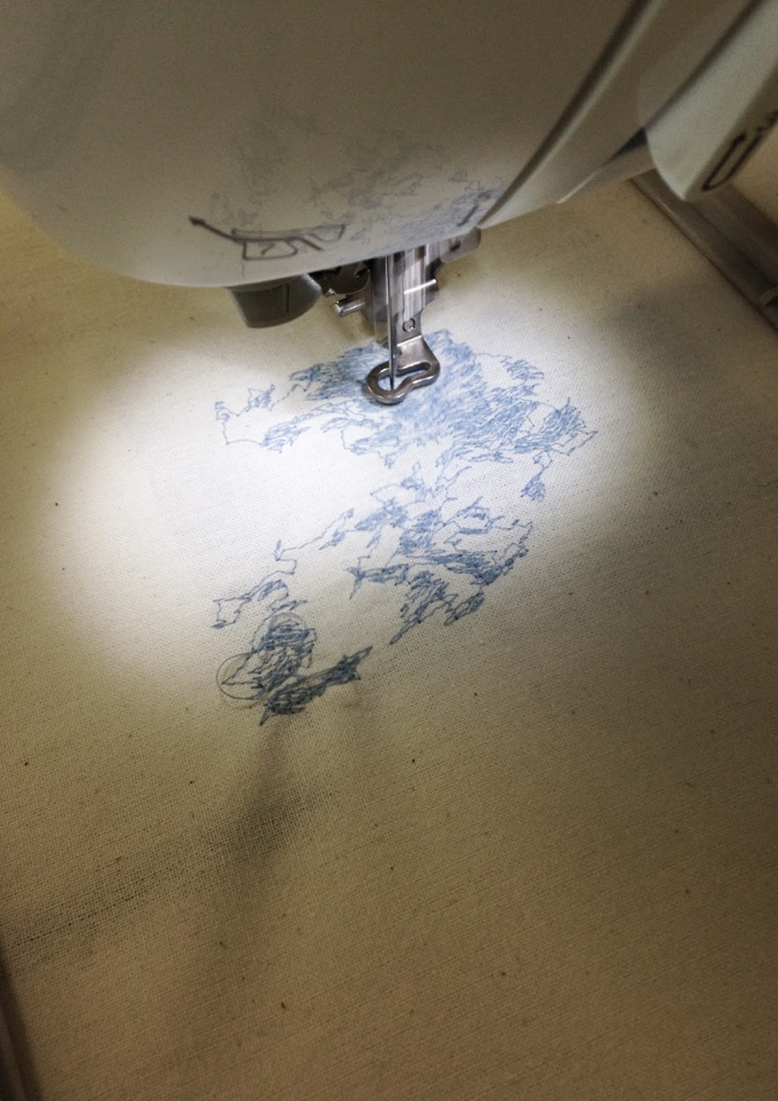
I first used a photograph that i took without editing it before it was sewn on to the fabric.
The outcome was disappointing  - it wasn't clear and quite messy.
 This image shows the process of what the embroidery machine will do and what thread is needed to make the design.  I wasn't sure if the image on the computer would be exactly what it would look like on the fabric.
Looking at these photos, i think the first image looks more like water than the second image. - I think the more colour is used the more the image will get lost.


My second try with the embroidery machine was much better. Instead of using the image process on the program, I used the punch parameter.  The image is so much clearer and simple, i think it looks more like water than the first experiment - It looks more modern as well i think.


And because my theme is about water contamination by textile dyeing, I will only use white thread to make the pattern. Ive had to first really simplify the images I took before editing it on the program.

I really like only using white thread  and now i have the opportunity to naturally hand dye these patterns to share that knowledge that there are easy ways of dyeing textiles in an eco friendly way. 


Experimentation - Sublimation Printing.


I started off with sublimation printing for my experimenting. Ive combined my own images with Lu Guangs photographs of the area that has been affected by the contaminated waters. I thought visually this would give a great impact to the viewers - to give that strong message as well.

The print above was done on a scuba material, i did not edit the image before printing it and the outcome was quite purple in colour. This print is not as modern as i wanted it to be and I don't see how these realistic images would look professional on my garments. 

I decided to try the sublimation printing with just my images that i took of water. I first edited the colour by making the saturation very vibrant -- 
But the outcome wasn't what I was expecting, the colour was too vibrant and didn't give much of an impact. --


After designing this print on the illustration below I find it quite straightforward and seems as if there was not too much development in this design. 


Looking at these experiments made realise that this process does not relate to my concept or the message I am trying to convey through my garments. 

Japanese Dyeing.

I just discovered a new article on Vogue. com about a Japanese indigo dyeing technique. 
This article is very relatable to my project because its about natural Indigo dyeing and quite a traditional process in japan. And it is the only country where this natural dyeing process takes place. 


jacket and sweatshirt combined.

Studying the photographs of the villagers and workers in Xingtang, i noticed that not many wear clothing that have more than one function. I see them working in plain t-shirts and some not wearing anything, already I am planning on designing a simple sustainable t-shirt but i want to design something that can be functional- almost a two in one jacket/sweatshirt that can be worn outside as well as keeping the villagers warm.

Not only would these garments be functional but also sustainable, organic and environmentally friendly -  I would hope that being aware of this would make the workers and villagers understand that there are simpler and healthier ways of making clothes/dying clothes.

Below are inspirational and visual ideas of the jacket and sweatshirt I am going to design --


Waterles dying processes.

Natural Indigo dyeing.

I need to research more about waterless dying that can enrich my garments and encourage that message about how water does not need to be used in order to create colourful clothing.

 http://www.wildcolours.co.uk/html/indigo.html


Cotton is one of the world’s most popular fabrics for clothes. With indigo there is no need to mordant the fabric beforehand. Mordanting is a time-consuming process but most other natural dyes require you to mordant the cotton first. The original blue jeans were dyed with indigo.

Indigo was traditionally used to dye blue cloth in Japan. Indigo dye was long-lasting and practical, did not show the dirt and the Japanese believed that indigo dye protected the material against moths and insects.

I have noticed that even though Inidgo is a natural dying compound, you still need to use a large amount of water to create just a minor amount of fabric. -- I need to research ways of cleaning and purifying indigo-dyed water.

http://news.cornell.edu/stories/2013/09/treated-fibers-clean-dye-polluted-waters

http://www.popsci.com/blog-network/techtiles/problem-indigo


http://download.springer.com/static/pdf/178/art%253A10.1186%252Fs40691-014-0016-3.pdf?originUrl=http%3A%2F%2Flink.springer.com%2Farticle%2F10.1186%2Fs40691-014-0016-3&token2=exp=1461670082~acl=%2Fstatic%2Fpdf%2F178%2Fart%25253A10.1186%25252Fs40691-014-0016-3.pdf%3ForiginUrl%3Dhttp%253A%252F%252Flink.springer.com%252Farticle%252F10.1186%252Fs40691-014-0016-3*~hmac=8e93b58b050c41b235908fab7b31eabfdeaa18f51a52b457e06a75e62a5ade17


http://www.ncbi.nlm.nih.gov/pubmed/20389008

cationic hydrogels
sodium permanganate

Fique fibres from the fique plant purifies indigo-dyed fabric.


http://conservationmagazine.org/2013/12/fique-plant-cleans-up-dye/

http://pubs.rsc.org/en/content/articlelanding/2013/gc/c3gc40911b#!divAbstract -- Nano-enabled fique fibres.

https://36readyblog.com/2013/01/12/water-purification-simple-and-inexpensive-methods/

https://books.google.co.uk/books?id=05ORCwAAQBAJ&pg=PA102&lpg=PA102&dq=fique+fibres&source=bl&ots=LE6ncKii2b&sig=7znieV_U2I-3BGzkOLreiOWfe1I&hl=en&sa=X&ved=0ahUKEwia6Z2NnKzMAhVaOMAKHRtVBMIQ6AEIQjAG#v=onepage&q=fique%20fibres&f=false


After researching all these websites above, I have finally discovered a way of cleaning the water after it has been chemically contaminated with Indigo dye.
ChemistryLand. com conducted an experiement to see which resins would absorb the colour and toxins from the dyed water. Activated Charcoal was successful in filtering both the colour and toxins in the water.

http://www.chemistryland.com/CHM107Lab/Lab5/Filters/Lab5Exp2filters.html
Activated charcoal means it has been heated to increase its ability to absorb molecules. It is also used to filter and purify liquids, to absorb poisons (as in gas mask filters), and in emergency situations to neutralize swallowed poisons. 


Today I was unable to attend the photoshoot at Rush SkatePark in Stroud. Although i was prepared for the shoot I discovered some mis-calculations in my construction of the jeans and the neatness of my underwear was not the best as it could be.

I did use the over-locker machine to neaten the jeans and to get any threads cut off. Looking at my first outfit I am not satisfied with the quality and style of them. I think I needed to do more research on bras shapes and the construction of them before designing and sewing my own. I think that this could of been easier for me to get the measurements more accurate rather than estimating.

however, I think that the jeans are the best I could of done and all I need to do is sew some more hem lines to get an authentic Jeans effect and add rivets in the corners of all the pockets.

I have been updated by Elle magazine about the purpose of rivets on jeans. --

http://www.elleuk.com/fashion/news/icymi-those-little-metal-things-on-your-jeans-serve-an-important-purpose    --


I have bought two sewing patterns; one is for mens straight-cut jeans and the other is underwear for women.

What I plan to do is complete the bra first which will come from a sewing pattern and complete the underwear then I can move on to the mens outfit - which will just be the jeans and underwear.

Tomorrow I need to update my sketchbook, look at label designs for my jeans and accessories if possible.


If underwear and jeans are too risky for a fashion show I may have to consider designing sweatshirts which would be sustainable for the villagers in Xintang. - I have gathered inspiration of more modern shapes - and maybe the possibility of using the denim fabric rather than the organic jersey cotton.

Here is my Pinterest board where I source additional inspiration. --

https://uk.pinterest.com/beccymary98/photoshoot-the-tears-series/


Neil Kraft / KraftWorks.

http://www.kraftworksnyc.com/calvin-klein-2/


Neil Kraft is a creative director, his job is to get brands noticed by his co-oordinating and creative skills through photography, style and theme which works for each brand or organisation.

In the 90's, Calvin Klein was losing relevancy with consumers and needed to do something drastic to get his brand noticed. Neil was tasked with helping to reinvent the brand, which was important for changing the consumers perceptions. Neil modernised the brands logo, packaging and shopping bag, as well as helping launch and reconceive the groundbreaking CKOne and Obsession fragrances. All efforts further solidified Calvin Klein as the essential brand for young urban consumers.


Photoshoot Ready.

Tomorrow is the Photoshoot at the Rush Skatepark in Stroud. I need to be prepared for the shoot and to be on time. -  I have to get a kit together in order to create a good photoshoot to compliment the surroundings as well as my garments on the model.

i have decided to go for a natural, fresh look. For inspiration I have looked at photographs and photoshoots by tyrone Lebon and Calvin Klein.
What i love about Calvin Kleins photographs are the fresh and dewy style. I like the black and white photographs with the lighting focusing on the garments. The make-up was done wisely, focusing more on the highlighting and embracing the models features rather making it look like they were trying too hard with the make-up.

Here I have gathered inspirational make-up and photoshoot composition ideas.


I have got all make-up and other products to use on the model. I have tried to replicate the colours from these images above.  I will also need to get a zipped jacket for the model because the studio area is very cold and i need my model to be as comfortable as possible for this shoot. 


Illustrations.

Patches/Embroidery trends 2016.

Pattern Cutting.


Learning and Understanding the terminology of pattern cutting instructions is very difficult, for me. I have never followed a step by step process for making a garment and even though I knew this was going to be challenge I know it will make the quality of my garments at a higher standard. My garments and the style of them are very minimal and simplistic- this means that I need to show good sewing techniques in order to create something visually engaging.

I had asked my lecturer numerous of times to help with my pattern cutting instructions for the jeans and even had one of my peers help me. I realised that I needed to concentrate on the methods of following a pattern so that I didn't need to keep asking for help from both the lecturer and the peers.

I spent one whole day putting together my jeans and tried to document every step and tips that my lecturer gave me. After I completed them I adjusted the measurements while the model was trying them on so that they would fit in flattering and comfortable way.


I knew that my underwear wouldn't take as long as the jeans would. So once i finished the jeans, i moved onto the underwear because it is important that i get the measurements and shape as accurate as possible. The previous day I noted down the measurements of my model so that I was prepared to sew them in the right size and shape.
The picture above shows an example of what style i am going for - the "engendered" design. I used a jersey fabric for my toiling to understand the elasticity that the fabric would have once it was sewn. Because my organic cotton jersey is very delicate and soft I need to overlock all hems so that the underwear and bra does not unthread.

EMBRIODERY.

After experimenting with the sublimation print. I found that the image looked too flat and not a effective as could be. I want it to look more 3D to make the images more realistic and almost alive.

Looking at the AW/16 fashion runways, I found a very strong trend of embroidery in both the ready-to-wear fashion and haute couture.
Looking at all of the creative and artistic embroidery on the runway made each garment come to life - they had their own personality and their story.

After seeing what embroidery can achieve i think using this technique on top of the sublimation print could really bring out my strong concept and i think visually it will look energetic on the runway.


GUCCI 2016

ALEXANDER MCQUEEN 2016

Gucci and Alexander Mcqueens 2016 collections were full of enchanting embroidery. They were fresh and even though these completely different designers used the same embroidery, they each told different stories and had unique styles. 

Guccis jeans looked striking with the floral embroidery,  it gives the garment a new depth and composition against the strong denim. 
Alexander Mcqueens embriodery is more embellished giving a mystical sense, each garment is filled with colour by only the embroidery with a blank canvas underneath. 

I think the embellishing makes the garments tell a story, expressing what the designer was trying communicate and this is what I am hoping to achieve for my final garments as my project is based on communicating a devastation and raising awareness. 
© The Tears Series

This site uses cookies from Google to deliver its services - Click here for information.

Professional Blog Designs by pipdig