Jacket Evaluation.


What I have done so far is applying the thread from the denim by using the embroidery machine, I used this because I don't want the thread to look like it has been stuck down onto the jacket - I want it to flow like water and fall down from the jacket and I think so far I have achieved this. However, i think there does need to be more of this thread just to give a bigger impact, visually. The thread also shows my inspiration and references from designers that have used a similar style or theme to mine. 

The embriodery was cut out and then sewn on because i wanted to place it specific areas that I thought would look better rather than just placing a big piece of embroidery all together. I like this idea but there needs to be more that is why after doing some more experiments I can actually use a quicker technique to get the same effect as the embroidery. I am actually going to sew in-between the embroidery where it looks slightly too messy because the pattern gets lost. I will be using white because my whole collection does not have such a distinctive colour other than ecru. 


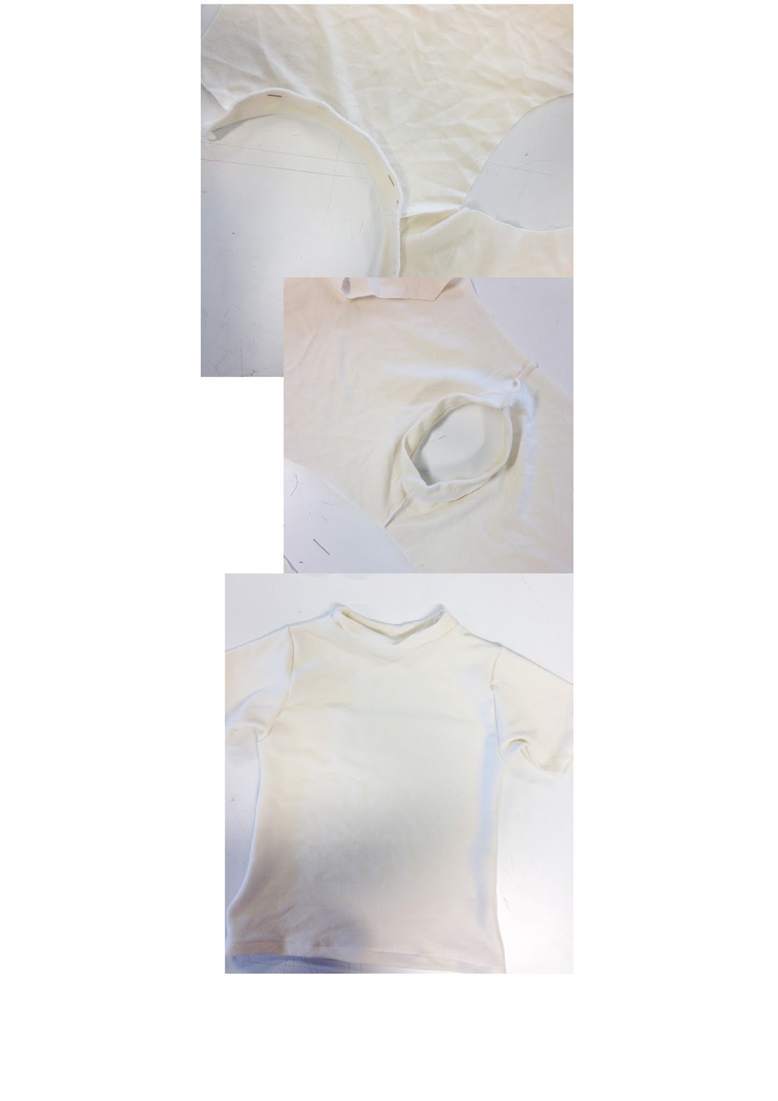
I can do the finishing touches at home because i have already done the overlocking where it is needed. 

Jacket Final Experiments.

My jacket is the show piece therefore it really needs to standout by the quality and visual aesthetics.
I really needed to final experiment samples in order to know that i have tried other techniques that can bring my jacket to higher scale of creativity.

I wanted to create something quite similar to my embroidery pattern to have a flowing texture all round.

The first image shows a freerer style that does look quite similar to the embroidery but i am worried it will look to busy and such a big piece of garment. I want something more thicker and defined.

The second image has a more zig-zig effect but it is thicker which I is what i am trying to achieve. If I push the fabric while it is sewing the gaps get bigger and the shape is more defined which is not what I am looking for but as you can see on the third image it can get thicker if i keep doing more layers on top of it and keep the speed similar all round.
I really like this because It will actually help neaten areas of my jacket to hide some dye that wasn't suppose to be there and I can sew like this around the gaps of my embroidery pattern just to add more texture and shape to the jacket.

I have used a normal blue thread but i know this won't look good on my jacket because the dye isn't as dark as this colour and I think it will hide away from the white thread that was used for the embroidery pattern.

Childrenswear T-shirt.

I really wasn't pleased with my first t-shirt for the children swear outfit - the size wasn't accurate, it was too big and the neck line was done properly.
I spoke to Kay for some guidance and my outcome is so much because now it looks a simple t-shirt that has been done at a better standard. I am going to keep the t-shirt as it is because i don't want too much detail to hide away the quality and purity of the outfit.

The Childrenswear outfit is finally complete and I am really pleased with the outcome because it flows well with the womenswear and menswear by dyed areas and similar style.

Embroidery and Embellishing.


Inspiration and References - General; Ximon Lee; Faustine Steinmetz; Marquis Almeida.

 Before starting to put any textures or colour onto my jacket I really need more inspiration and direction. I was encouraged to do more research after the show selection where the lectures recommended me to do more to give a higher impact to the garments.


General Inspiration : exploring shapes, composition, texture and colour compositions. Researched the recent trends and styles this month e.g. Dior, Chanel.


Menswear Designer Ximon Lee, Has created an oversized collection this year. I have chosen him as one of the references because of the colours; textures and modern look.  His work has definitely made me want to explore other ways of constructed my bomber jacket by including the frays and embracing more of the organic side of my concept and the fabrics.


I discovered Faustine Steinmetz in the i-D magazine.  I was so engaged by his innovative and daring creations. He has manipulated denim fabric taking it beyond its constraints. I find this collection very modern even though it has a sense of fine art by the volume of texture he has used. And the amount to look at doesn't hide that high quality design.
It really engaged me because I see more of a water effect which relates to my theme and i think this will definitely bring my garments to higher standard.


Marquis Almeidas collection is much cleaner in design than Faustines style but it does have a similar oversized look. He is a reference because i think his style gives off a sense of undressing which is something I have included when looking at photography inspiration and after talking to the lecturers about having my underwear on show i think Marquis's work will help me assemble my garments in an appropriate demeanor. I really like how his use of colour is very clean and more block. I think it makes the whole outfit look ore modern and this is where I need work on for my garments. This will remind me not make the dye to wash-like and more full to give this effect.

The Tears Series Label

I was advised to make the underwear a higher waist to make the audience aware that I also made them as well. For the label I dyed white thread using the natural indigo dye and then used the embroidery machine. 
I decided to make it Chinese as a sign of respect and a notice that we can be aware of their situation and what water pollution can do. 

I hand sewed the label onto the underwear giving a more natural and authentic look. 


i don't know if visually this looks quite commercial and quite cheap but I need to put the whole outfit together to see the quality better. 

Shoes. Traditional Chinese Geta.

During the later stage of this project I will need to consider accessories for my each outfit and because I was told that barefoot will not be an option for the fashion show, i will need to design my own - I think this will reflect my understanding of their traditions and the respect i have after reading about what they do for the sake of "pretty" jeans.

Dip-Dye. Natural Indigo.

I have started to dye my bomber jacket but also the bottom of each pair of jeans. I thought visually it would look quite interesting and I think it would make the viewers understand where my inspiration came from and the concept that I am getting across.

To hand dye the bottom of the jeans I needed first wet the fabric and then dust the powder dye on top, then I used my hands to spread dye all over the fabric. This made it easier for me to get the colour I wanted. (More deeper than lighter because it will look more engaging to the viewers).

After a day and a half the fabric finally dried, i really like this colour it was slightly lighter than expected but its a unique colour that you don't see very on denim fabric.  I noticed that that hem was fraying away slightly leaving strands hanging off but it gives the jeans more texture and the strands absorb more of the dye making it more visible.- I will sew the hem on the outside to show fraying texture.


For my collection to be a strong statement i really need to create more texture to encourage my message I am trying to convey. 

I unthreaded the denim which created curly strands,  I dyed this and the denim underneath. Using a hand embellisher i binder the two together. I think this quick experiment has really pushed my ideas for the bomber jacket. It looks in a sense unusual and some like its representing a disease almost which is perfect because my concept involves the cancer that is a regular occurrence caused by the water pollution. 
I don't like the blue i think it looks to washed out it needs to be more bold. 

Progression Presentation.


After the presentation and getting some feedback about my garments, I have really good ideas that I think will bring my garments together more as a collection.

I've got quite a bit to think about and consider for each of my outfits . I have been suggested to add more indigo into each item to link them more - for this I will need to experiment more and research designers who have had a similar theme or have used denim for their collection.

My underwear was non-existent in my presentation as it was covered by the jeans and t-shirts which was said to of been pointless of even making. Therefore, i considered the idea of having the bra for the womenswear, over the top of the t-shirt and having the pant highwaisted.  ( for menswear and children swear). Visually i think this would look quite engaging because it is slightly unusual and gives a modern sense to the collection.

The label which is to be embroidered onto my garments was well received by the lecturers but it has to be visible in order for the audience to see it and be more interested. - this means i need to place the label in a not-so-obvious place on each garment.


The jacket still needs more development which will be a main focus for tomorrows timetable.

Boys wear. Outfit one.


This photograph was done by myself. I edited it on photoshop changing it to grayscale and then using a cool filter to give a more cool effect which would correlate to my water concept.

I really like this photo because it displays everything i have made accept the t-shirt but it is the exact style only in a different fabric.  The only negative is that the models toe is out of frame giving it a lower quality than it could be.

Indigo Dye Experiment.

After talking to my lecturer about ways of getting higher grades, I decided to include the indigo dying process in my garments. 
Xintangs rivers are mainly polluted and contaminated by the dying chemicals that are used to colour the jeans and bras. I decided to use Indigo dye because it is a prominent colour used in the jeans manufacturing. 

I bought natural indigo dye because of my sustainable and eco-friendly methods throughout this project. The natural indigo dye was powder which was then diluted in tap water - i had to use quite a bit of this powder to get to a more deeper blue. The photo below shows what It looks like once dissolved in the water. 

I then got a sample of my sustainable denim fabric and used a brush to apply the indigo dye. I had to put quite a bit of the dye on to get more of a blue colour rather than a green/turquoise. 


I really like the colour on the denim, it definitely brings out that "jeans" effect. I would like to use this process on my jacket but only a small amount of this colour because my concept is about purifying and cleansing the fashion industries ways of making clothes.

I then decided to apply the dye on the embroidery pattern which is suppose to look like water. Instead of putting it on the denim I dyed the thread instead but i think it looks quite messy and would prefer it to be on the denim rather than the thread.

Mens Jeans -Toile.

I wanted to make sure that the mens jeans were accurately sewn and that measurements would fit the model comfortably. I got a lot of help from Kay (first years lecturer) because she has had a great deal of experience making jeans -  she gave me easy tips to sew my jeans quicker than what was said on the pattern instructions. 

The model tried them on and they fit nearly perfectly - the hem line needs to be smaller. I mustn't forget to add the rivets and the jeans button.
© The Tears Series

This site uses cookies from Google to deliver its services - Click here for information.

Professional Blog Designs by pipdig